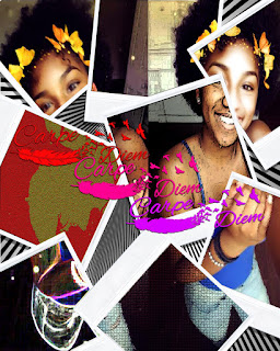
1. The strongest area of my work was the filter gallery, the
backgrounds, and the drop shadows because I wanted to make the pictures in the
Polaroid to pop out so that's what I used the filter gallery for. For the
background, I used an illusion image so it can look like the background is
moving the Polaroids, but it really isn't. Lastly, for the drop shadows, it was
used on the "Carpe Diem" and on the Polaroids so it can also make it
pop out a little.
2. What I could've improved on in my work would be the background
and the spacing of the Polaroids, only because the Polaroids were to make the
pictures combine as one but spaced out at the same time. Also, for the
background, I wanted to use a background that would blend with the images or
maybe the effects of the Polaroid images.
3. What I found easy about this project was placing the Polaroids
in random areas and quick selecting parts of the images to make it look like its
one Polaroid on top of another. I also think that the polygonal lasso tool was
very quick to learn how to use to make the images more realistic.
4. I believe the difficulty in this project was when I had to find
a good-enough background that can make the image better, but also having to use
the "Carpe Diem" captions in the images. It took me a couple tries to
place the captions in a good area to make my image better.
5. The materials I used were polygonal lasso, quick selection,
auto-select, drop shadow, drop merge, fill, free-transform, eraser, and zoom. I
used the polygonal lasso tool and the eraser to make the Polaroids go on top of
each other to make it more realistic. I used the quick selection to color the
"Carpe Diem" captions. I used the auto-select to make it easier when
I select certain layers or tools. I used the drop shadow to give the Polaroids
and captions a shadow to reflect on the image, I used the drop merge to collide
layers, so I don't have so many layers. I used the fill to color the captions,
also I used the free-transform to move them around, which did take time to
consider where they could be placed. I used the eraser to erase anything that
wasn't needed in the image, and I used the zoom tool to zoom in and out.
6. What I did to demonstrate my goal in this activity was using
the tools I already knew how to use to do the dirty work, and then trying to
play with the tools that I wasn’t so familiar of using, so I can get a good
understanding of how each tool functions, depending if it will be used to
complete my project or not.
7. What I would do differently in this activity would be adding
more Polaroids and adding a different background to make it more of a pop-out
image, but, I also would use a different image of myself, because I used a
2-in-1 image for the project, so certain areas in that image came out the way I
didn’t want, but couldn’t fix.
