Bri Blogger
Tuesday, January 24, 2017
1. The strongest area in my final project is the 3 boxes that was hand-drawn by me. I believe it because trying to trace as many shapes as possible was a lot of work and time that passed by, I didn't think the drawing would come out as good but it did.
2. I could've improved on the coloring since it looks very light, compared to the gradients that were shaded in. I could've also drew more of what was in the background to make this image more realistic and complete.
3. What was easy about this project was how it was explained. We were supposed to use the gradient tools and to trace as many shapes as possible and the rest would be drawn and then we place our drawing on the scanned image. The project itself was pretty easy but actually putting certain things the way I wanted was a little tough.
4. What was difficult about this project was when I completed the drawing and filled as many shapes as possible, then to put one on the other and seeing the result. I expected that when that part was done, the project would be completed but then, I seen that most parts of the boxes had white spots. That signifies that I didn't fully draw what had to be drawn.
5. In Illustrator, I used the pen tool, the convert anchor point tool, the eraser, and the zoom in/out tool. In Photoshop, I used the new layers tool, the fill tool, the quick selection tool, and the deselection tool.
6. I demonstrated this project to look like a realistic picture of Christmas Ornaments, by selecting 3 random boxes to draw and 3 to use the gradient tools to makes as many shapes as I could.
7. What I would do differently in this project, if I could, is to pick a different box that has more to trace with the gradient tool. It was easy to use when I made certain shapes, then I would've drawn the little details and have it how I would want it, but I learned a lot with the tools in Illustrator by being curious of what each tool is used for.
Tuesday, December 6, 2016
1. The strongest area of my work was actually drawing myself. This drawing describes me literally taking my head off from my body, just because. It took a couple classes to actually get the lines filled in so I can move on to shading the drawing with color. Once this idea came to my head, I knew I had to make it realistic and interesting for all eyes, it’s something different to me that I made.
2. I could’ve improved on the coloring and the lines and curves. When I was using the quick selection tool to select parts of my body and would fill the colors in, it would have parts of the dark lines shaded in or not. It was messing me up because some parts would be darken with the lines and some wouldn’t, so it looked like I didn’t know how to color correctly.
3. What was easy was when I was filling in what needed to be shaded in and changing the opacity so it can look a little more realistic. Also, tracing certain parts of the drawing the didn't involve so much of curving like the shoes or head, they were pretty simple.
4. What was difficult in this activity was having to trace what wasn't as easy as I thought it would be such as the shoe lace, the blood stains or the mouth. Other than that, everything was a bit easy to complete.
5. The materials I used in Illustrator was mostly the pen tool and the anchor tool to add points that would make the tracing easier. In Photoshop, I used the quick selection tool, the fill tool, the layer tool, and the zooming tool.
6. I demonstrated my drawing as myself literally ripping my head off because, knowing how senior year is the most important year because of colleges, grades, and improving for the better, ripping my head off is symbolizing how it makes me feel to do so much at once, even though it's worth it in the long run.
7. What I would try again for this activity, is that I would improve of the curves and maybe a background that would make it more eye-opening and interesting. I would definitely change what I'm doing, maybe i could've drew one leg in the air with balloons coming out of my ear, something creative and eye-opening to others.
Tuesday, November 1, 2016
Thursday, October 27, 2016
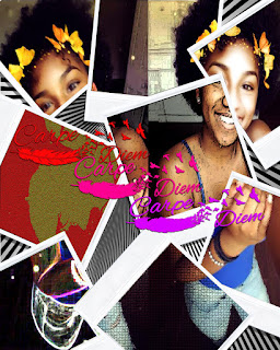
1. The strongest area of my work was the filter gallery, the
backgrounds, and the drop shadows because I wanted to make the pictures in the
Polaroid to pop out so that's what I used the filter gallery for. For the
background, I used an illusion image so it can look like the background is
moving the Polaroids, but it really isn't. Lastly, for the drop shadows, it was
used on the "Carpe Diem" and on the Polaroids so it can also make it
pop out a little.
2. What I could've improved on in my work would be the background
and the spacing of the Polaroids, only because the Polaroids were to make the
pictures combine as one but spaced out at the same time. Also, for the
background, I wanted to use a background that would blend with the images or
maybe the effects of the Polaroid images.
3. What I found easy about this project was placing the Polaroids
in random areas and quick selecting parts of the images to make it look like its
one Polaroid on top of another. I also think that the polygonal lasso tool was
very quick to learn how to use to make the images more realistic.
4. I believe the difficulty in this project was when I had to find
a good-enough background that can make the image better, but also having to use
the "Carpe Diem" captions in the images. It took me a couple tries to
place the captions in a good area to make my image better.
5. The materials I used were polygonal lasso, quick selection,
auto-select, drop shadow, drop merge, fill, free-transform, eraser, and zoom. I
used the polygonal lasso tool and the eraser to make the Polaroids go on top of
each other to make it more realistic. I used the quick selection to color the
"Carpe Diem" captions. I used the auto-select to make it easier when
I select certain layers or tools. I used the drop shadow to give the Polaroids
and captions a shadow to reflect on the image, I used the drop merge to collide
layers, so I don't have so many layers. I used the fill to color the captions,
also I used the free-transform to move them around, which did take time to
consider where they could be placed. I used the eraser to erase anything that
wasn't needed in the image, and I used the zoom tool to zoom in and out.
6. What I did to demonstrate my goal in this activity was using
the tools I already knew how to use to do the dirty work, and then trying to
play with the tools that I wasn’t so familiar of using, so I can get a good
understanding of how each tool functions, depending if it will be used to
complete my project or not.
7. What I would do differently in this activity would be adding
more Polaroids and adding a different background to make it more of a pop-out
image, but, I also would use a different image of myself, because I used a
2-in-1 image for the project, so certain areas in that image came out the way I
didn’t want, but couldn’t fix.
Monday, October 24, 2016
1. The strongest area of my work is placing the letters and adding bright colors because even though its a lot of work & practice, once you get the hang of it you play around with your work, to make it better.
2. The area of work that can be improved more is when i start to quick select certain areas of the B's in between the bigger B.
3. What was easy about this activity was that I knew what I was doing and also, it was all based on one letter you picked.
4. What was difficult about this activity was that I couldn't find a really good background to go with my art.
5. The materials I used were quick selection tool, zoom, fill, layer new layer, and deselect. I quick selected certain areas that I wanted to color & zoomed in or out, depending if i needed to. The layer new layer was used to create layers that i colored or designed so it doesn't mess me up as I did my project. For example, if I wanted to change the color of one of the letters, I could either quick select the layer and fill in a different layer or just delete that layer and start again, up to you. To deselect is to basically undo the quick selection and the fill is based on coloring or designing what you quick selected.
6. I demonstrated my goal by using the materials that I knew how to use and played around to see the outcome. A lot of different ideas ran through my mind before making my final decision.
7. If i did this again, I probably would've done the alphabet, make it 3D, or maybe choose a better background.
Subscribe to:
Posts (Atom)